On archiving, or deleting, old tweets
Museum Design / Urban Design
March 4, 2011
I had a chance to visit the Book of the Dead exhibition at the British Museum tonight, not long before the expo closes and perhaps moves to another venue.
It was (IIRC) my fist visit to the British Museum, and a chance to gape at the grandeur of its architecture, with its waving glass roof and great white cylinder in its middle.
The exhibition itself was, in some way, an example of both the best and the worst of exhibition design. Clearly well thought out and researched, it had a daunting wealth of artefacts, most of them coming with good explanations. The lighting was subdued, probably for technical reasons, but it managed to create a nice atmosphere.
The best parts of the exhibition’s design were perhaps also its worst:
- The audio guide, well made if a little redundant, had extensive audio and video segments focusing on details or context of some of the artefacts. The audioguide devices were obviously ipods in disguise, and thus allowed some slide-and-touch interaction with enlarged photos of some of the artefacts, letting the visitor learn about tiny details one would have missed otherwise.
- Children were well thought of: families were given sheets of paper (a.k.a “scrolls”, I assume) which could be inserted in slots distributed throughout the exhibition, allowing children to collect spells from the book.
These two (optional) additions to the overall experience would be great if, in spite of a strict reservation system, the exhibition hadn’t been so awfully crowded. The situation reminded me of some work I did (or, honestly, pretended to do) in university around urban traffic simulation: get a lot of people (or vehicles) going on the same lane, in the same direction but at vastly different paces, and you get… a traffic jam.
Too many times during my visit did I get into a corridor-like space, with exhibits on both sides, hardly enough space to have a row of people on each side, and yet you’d happen to have two audioguide entries in this space (hence people standing there for long minutes at a time) and a interactive slot/printer for the “family game” (hence small kids scrambling to go through the dense crowd to get to the booth). At various times, I was tempted to just bully my way through the crowd and out – I managed to remain patient and actually really enjoyed the exhibition towards the end, where each room had more space to breathe, think and shuffle between exhibits.
Time for museum curators to talk to urban planners, I guess – and vice versa.
Previous/Next
Ai WeiWei's sunflower seeds at the Tate Modern
2011-01-16
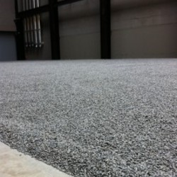
It starts with smell. The smell of rain. The dry smell of rain, as the first drops hit the stone pavement. When you enter the immense hall of the tate modern, this smell the first thing that will hit you, followed shortly by the sound of ghosts raking the field of Ai Weiwei's sunflower seeds as monks would a zen garden full of small pebbles. Ten centimeters deep, and the surface of a couple basketball fields.
Twitter, archives and hacking
2011-03-06


